Where you race series · part 1 of 2
Britain's fastest tracks
Using every result on OpenTrack, we separate a track's genuine speed from the athletes who happen to race there. The venue matters most over distance, and the 10,000m shows how the method can be fooled.
14 June 2026 · 11 min read
TL;DR
- Some British tracks really are quicker than others, but by a slight margin, almost all of it over distance (think 5,000m and the mile). In the sprints it barely registers.
- We separate the track from the runners who happen to race there by following the same athletes between venues, the way chess ratings compare players through a chain of games.
- The order of the ranking is reliable; the size of each gap is not. Most of any big gap is the field a venue draws, not the surface, so we show where you’d line up fast or slow, not a predicted time.
Every runner has a fast track and a slow track in their head. The one where it just flows, and the windy one out east where you grind. We wanted to know how much of that is real, so we took every result on OpenTrack and asked, for all of Britain: which tracks actually make you faster?
The answer is smaller than you'd think. Rank Britain's tracks by the raw times run on them and you mostly rank the crowds, not the ovals. Adjust for who actually showed up and the order reshuffles top to bottom. Real differences between tracks do exist, but they are slight, and one event broke our method so completely that it turned into the most useful result in here.
Every number here is built on data from OpenTrack, the live results platform for track and field. Our thanks to them for keeping the sport's results open.
The geography of speed · drag · zoom · click to pin
fasterslower= more runners
Hover a track to read it, or click to keep it pinned.
Loading the map…
Hover a track to read it, click to keep it pinned. Colour is the venue’s speed (controlling for who races there); size is how many runners we have for it. Bigger dots are the ones we’re surest about.
That map is the answer we end up with: every track in Britain, red where runners go quick and blue where they go slow. A coloured dot is easy. A coloured dot you can trust is harder. The rest of this is the working, laid out so you can poke at every claim, building from "rank the tracks by their times" (which turns out to be wrong) to a ranking you could plan a season around.
If you only want the practical version, here it is: a track can tip you a little, almost entirely over distance, never in the sprints, and far less than the raw-time gaps suggest. Treat the order as reliable and the exact size as a hint. If anything ever tells you a venue is worth half a minute, it is counting the runners who race there, not the surface.
The trap: you can't read it off the clock
The obvious approach is to rank tracks by the times run on them. It doesn't work, and the same trap catches a lot of data. The fastest times happen where the fastest people go. A track that hosts the big graded meet looks lightning quick, but that is the field that turned up, not the floodlights. You end up measuring the speed of the athletes and calling it the speed of the venue.
Here it is in miniature. Take a set of 1500m venues, rank them by raw time, then rank them again once you account for who actually showed up. The order doesn't nudge. It reshuffles top to bottom.
The fastest times aren’t the fastest tracks
1500m venues. Play to reorder them once you control for who actually raced; reverse to put them back.
Loading…
Each line is one track. Lines that cross are tracks whose ranking changed once you account for who showed up. The order doesn’t nudge, it reshuffles top to bottom: fast times are mostly fast crowds, not fast tracks.
So the whole job is separating those two things, the track and the people on it. Everything below is one long answer to that.
A common currency for every race
Before we can compare anything, there's a problem. A 1:55 over 800m and a 15:30 over 5,000m are both excellent, but you can't put them on the same axis in seconds. You also can't compare a 14-year-old's 800m to a senior's.
So the first move is to convert every time into one universal unit: how far from typical it was, for that exact event, sex and age group. A run that's bang average scores zero, a good run is a bit below, a national-class run is well below. (Statisticians call it a z-score, but you can read it as "how good, on a scale where zero is ordinary.") Now an 800 and a 5k, a junior and a veteran all speak the same language, and "fast" means the same thing everywhere. From here on we work in that unit and only translate back to seconds at the end.
The trick: the same legs, two tracks
Now the core idea, which is older than running data. Baseball calls it a park factor, and economists use the same trick to grade workplaces. If you compare the same person in two places, their ability sits in both numbers, so it cancels, and what's left is the place.
This only works because of one crucial fact. OpenTrack stamps every result with a stable, global id for the athlete, so the same runner carries the same id whether they race in Aberdare in May or Battersea in July. That's what lets us take a 2:01 from one meet and a 1:58 from another, months and counties apart, and know it was the same pair of legs.
So take everyone who ran an 800m at both Ron Jones in Aberdare and Cardiff International, and plot each runner's time at one against their time at the other:
… comparisons — every time a runner raced an event at two or more tracks. x = their own level, y = their time at a track (standardised). Colour is the venue’s speed effect: red tracks sit below the line, blue above.
One runner tells you nothing, since an 800 swings ten seconds on the day. But line up everyone who ran both and the cloud tilts off the diagonal: most were quicker at Ron Jones. That tilt is the track, with ability cancelled out and the venue left behind. Flip the toggle to every comparison and the same tilt appears across the whole dataset at once.
One connected web
Comparing a runner against themselves gives a clean read on one pair of tracks. The trouble is that most pairs of British tracks share nobody. Hardly anyone has raced the same event at both Aberdare and Inverness, so there is no direct comparison to make.
Chess ratings have the same problem, and the same fix. You can only say one player is stronger than another if a chain of games connects them: A beat B, B beat C, on down to Z. A club that only ever plays itself can't be placed on the national scale at all. Shared runners are our games. Aberdare links to Cardiff through the runners who raced both, Cardiff on to Swansea, Swansea to the next, until every track hangs in one connected web and each is pinned relative to all the rest, including the ones no single runner ever joined directly.
So we ran that one comparison, a runner timed at two tracks, over and over, everywhere the threads reached:
Here's that web for real, every track landing at its true place on the map. Drag it around. The lines join tracks raced by the same runners, and the moving dots are those shared athletes travelling between them. A track woven in by hundreds of shared runners is pinned firmly; one dangling off the edge by a single runner is barely placed, and the model reports a wide error bar to say so.
The venue circuit · every track at its real place · two fingers to move
faster · slower · size = athletes
Loading the circuit…
Hover a venue to name it. Each track sits at its real location. Lines join tracks raced by the same runners, and the moving dots are those shared athletes travelling between them.
Splitting the track from everything else
The web tells us which venues can be compared. Now we do the sums. A model takes each standardised time and splits it into the pieces that made it: the venue, the runner's own level, their form that month, the wind, and plain luck on the day. Hand the model all of those at once and it solves for each. The piece we keep is the venue.
The piece that does the real work is the runner's level. It absorbs field strength, so stacking a meet with internationals no longer makes the track look fast, because each runner's own standard is subtracted back out. For the curious, here's the whole thing in one line:
▸The model, term by term
z = γ_venue + β·wind + τ·date + a_athlete + b_athlete·date + ε
- γ_venue: the venue effect. A fixed effect, exactly what we want to read off and report. Anything constant about a track (surface, altitude, the shape of the bowl) lives here. Recentred to mean zero, so it reads as faster or slower than typical.
- a_athlete: a random intercept per athlete, their overall level. This is the term that absorbs field strength, because each runner's own standard is subtracted out before the venue is weighed.
- b_athlete·date: a random slope, each athlete's form trajectory across the season, so "unfit in March here, flying in July there" can't masquerade as a venue effect. (It needs a real time span to estimate, which the two-year archive gives.)
- β·wind, τ·date: race-day wind, and the population's gradual fitness drift.
- ε: the irreducible race-to-race noise, about 7% on any given day.
Don't trust a thin sample
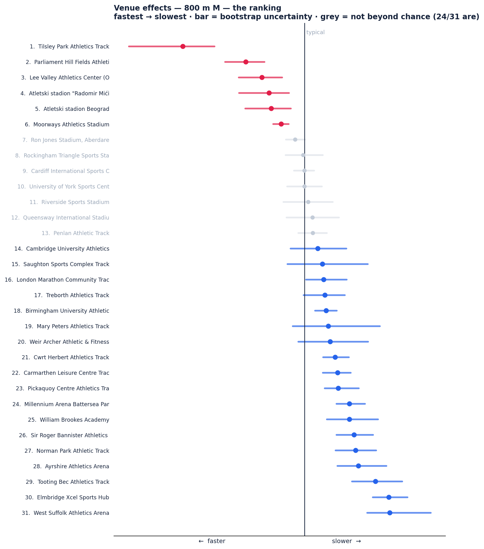
A venue raced by three people on one breezy evening shouldn't get to crown itself the fastest in Britain. So before reporting anything we do two things. First we shrink every venue's number toward ordinary in proportion to how shaky it is: a track with thousands of marks barely moves, a track with a handful gets pulled most of the way back. Then we attach an error bar by resampling the actual runners thousands of times (a bootstrap) and watching how far the number wanders. A venue whose answer barely changes is one we can stand behind; one that swings wildly is not.
Is the signal a mirage?
Two checks, and neither one trusts the model's own maths. First a placebo. We shuffle the venue labels so any real track-to-track signal is destroyed by design, then ask the model how much spread it finds in the nonsense. If our real spread were just noise dressed up, the shuffled runs would match it. They don't. The real spread sits far to the right of anything chance produces:
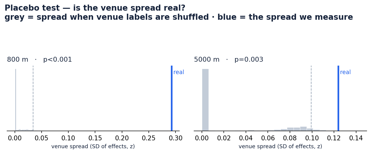
Second, the bootstrap from Step 6, drawn out per venue. Tracks whose effect survives the placebo are in colour; the rest are faded, because a number we can't defend isn't worth reporting:
But does it actually predict?
Surviving a placebo means the pattern is real. It doesn't mean it's useful. The test of useful is out-of-sample: hide races the model has never seen, predict them from the venue effect plus the runner's level, and check the guess. When we do that, the venue signal is clearest over distance and fades toward the sprints. Note the scale too: even at its strongest it stays small, real but never a big lever.
Where the track predicts (and how small it is)
How much of an unseen race the venue explains, by event (out-of-sample R²). Mind the scale: the bars are short on purpose.
Loading…
Real, but small. The signal holds up over distance and fades to near zero in the sprints, where reaction and wind drown it out. But look at the size: even the strongest honest event, the Mile, sits near R² 0.04, meaning the track explains only about 4% of why a runner is quicker at one venue than another. It’s statistically solid and reproducible, not a big lever. The 10,000m bar is the longest of all, but that one is a mirage: selection, not surface, for the reason below.
That fits the physiology. A 5,000m is a long, honest effort where the surface and the pace come through. A 100m is over before the track gets a say, buried under reaction and wind. The verdict: the track is real but minor. It shows up over distance, stays slight even there, and never reinvents you. Most of any gap you see between two venues is the field and the kind of races they host, not the surface.
The 10,000m breaks it, on purpose
Most events are raced all over the country, so comparing a runner across venues gives an honest read on the tracks. The 10,000m is the exception, and watching it break the method is the clearest way to see what the method can and can't do.
Hardly anyone races a 10,000m at their local track on a normal evening. British 10,000m running funnels into a few specialist meets, above all the big paced night at Parliament Hill in London, that runners travel to once a year. They turn up peaked, with pacemakers and a fast field to tow them round, for the express purpose of running a quick time.
The 10,000m trap
Loading…
Almost every British 10,000m is run at one of these few meets, on the one day a runner is peaked and paced to go fast. So the venue collects credit for speed the occasion produced, not the surface. The tell: this is the only event whose venue effect predicts the wrong way for other distances. A genuinely fast track would help everywhere; this one misleads.
Now think about what the model sees. For almost every runner, their only 10,000m sits at one of these few venues, run on the one day they were primed to fly. The track collects the credit for speed that the occasion produced. Our trick cancels out who the runner is, but it can't cancel out the fact that this is the place people go specifically to run fast. That is selection, not surface.
Here is how we know it's a mirage rather than a quick track. A real surface advantage shows up everywhere: if the Parliament Hill track made people fast, they'd also be a touch quicker in a 1500m or a 5000m there. The opposite happens. Feed the 10,000m venue effect into the other events and it predicts backwards, so the venues that look fastest over 10,000m are, if anything, slower for everything else. A real track effect helps you predict; this one actively misleads, and that backwards prediction is the fingerprint of selection rather than surface.
It's the one limit the method can't fully scrub. Differencing within a runner removes who races, but not what kind of race a venue tends to host. A fast track and a track that mostly hosts people trying to run fast are not the same thing, and rather than hide that, the model shows it to you.
So where would you run fastest?
That's the method, pointed back at you. Pick your event and it ranks Britain's tracks fastest to slowest for it. We show the order, not a predicted time, because the order is the part the model gets right (it's reproducible across independent halves of the data), while the size of each gap is mostly the kind of races a venue tends to host (a tactical league night runs slow on any surface), not the track itself.
Loading…
So it won't claim you'll run exactly 3:42 here and 3:49 there, and it shouldn't pretend to. What it can tell you reliably is which way a track will tip you. On a day you're chasing a standard, that's the useful half: line up at a track the model puts near the fast end for your event, treat the gap as a nudge rather than a promise, and don't read anything into it for races shorter than about a lap, where the surface barely gets a say.
So: which is your fast track, and which is your slow one? Pick your event above and see whether your gut was right. Then send it to the teammate who swears their home track is the quickest in the county, and let the data settle it.
We build ontrack to turn the noise of real training and racing into something you can act on. Every step here is open and reproducible.
Where you race series
Part 1 of 2
- 01Britain's fastest tracksyou’re here
- 02The world's fastest marathon courses