Ultrarunning series · part 3 of 3
An atlas of ultrarunning
Where the sport lives, where it's fastest, and how a fringe pursuit became a global phenomenon — mapped across six decades and 27,000 races.
24 June 2026 · 3 min read
For most of its history ultrarunning was a fringe of a fringe — a few hundred eccentrics a year, mostly in a handful of countries. Then, somewhere around the turn of the 1990s, it stopped being that. The archive captures the whole arc: a near-flat line for decades, then a curve that bends sharply upward and keeps going. This is the map and the boom — where the sport lives, where its runners are fastest, and how big it actually got.
Every number here is built on the DUV Ultra-Marathon Statistik, the volunteer-run archive of ultramarathon results, via the published Kaggle dataset of 7.5 million finishes. Our thanks to DUV for keeping the sport's history.
Where the sport lives
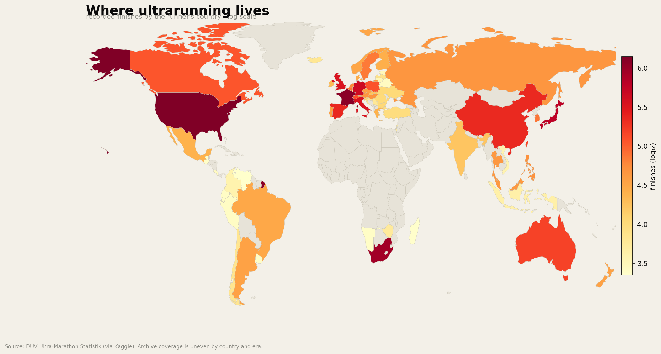
Coloured by how many recorded finishes each country's runners have logged, the map has a clear centre of gravity. The United States and France are far out in front — well over a million finishes each — then South Africa and Japan, with Germany and the UK behind. It's a mix of the countries that built the modern sport and the ones whose signature races (Comrades, UTMB, the American hundreds) pull runners from everywhere. The colour is on a log scale, because the leaders dwarf the rest; a linear map would be a couple of bright spots on a dark world.
One honest warning before reading too much into the pale regions: this is an archive's coverage, not a census. DUV's reach is deepest in Europe, North America and the established ultra nations, and thinner where results never made it into a database. An empty country on this map more often means "few results recorded here" than "nobody runs."
The boom
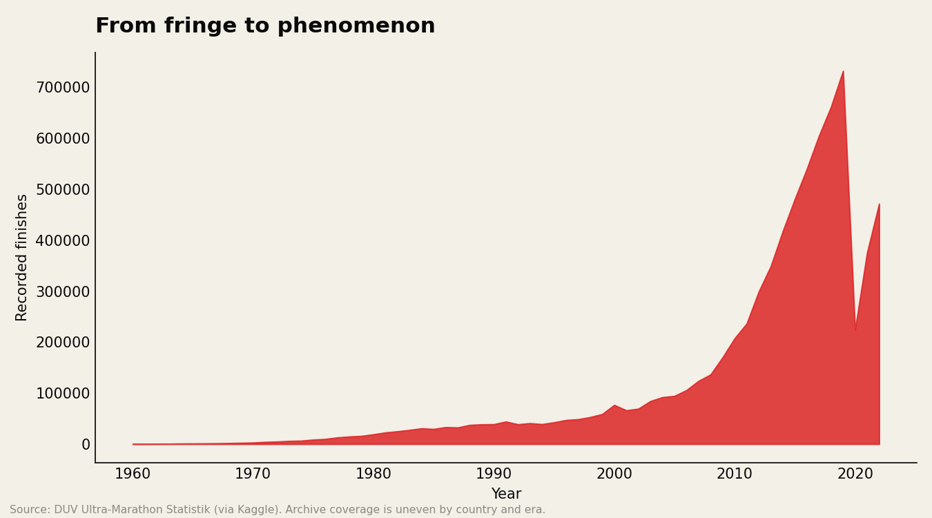
The growth curve is the cleanest single picture of what happened to the sport. For thirty years it's a low, slowly rising line — a few hundred finishes a year in the 1960s. From the early 1990s it lifts off, and the climb is relentless: the busiest year in the archive records more than 730,000 finishes, four orders of magnitude above where it started. The dip at the very end is the pandemic, not a downturn — 2020 and 2021 cancelled races worldwide — and some of the long-run shape is the archive still backfilling recent history, but the explosion is real and matches what anyone in the sport has watched happen.
Big isn't the same as fast
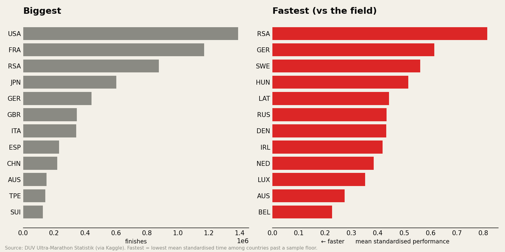
Volume and quality are different maps. Ranking countries by sheer number of finishes gives you the population centres — the USA and France. Ranking them by mean standardised performance — how their runners do relative to the global field, with distance and sex controlled — reshuffles the board: South Africa comes out fastest, then Germany and Sweden. South Africa is the telling case, near the top of both lists, because Comrades funnels a whole nation onto one fast road course. Meanwhile the volume giants sit mid-pack on speed, weighed down by the mountain and trail races that make up so much of their count. The size of a country's footprint tells you how many people run, not how fast — and the two come apart as soon as you look.
We've drawn this as a static atlas to launch; the underlying tables (finishes and pace by country and by year) are the same ones that would feed an interactive map, which is the natural next iteration if the post earns it.
This closes the first arc of a series built on the same 7.5M-result archive — the world's hardest ultras and the aging curve came before it. We build ontrack to turn the noise of real training and racing into something you can act on.
Ultrarunning series
Part 3 of 3
- 01The world's hardest ultras
- 02When do ultrarunners actually peak?
- 03An atlas of ultrarunningyou’re here