Ultrarunning series · part 1 of 3
The world's hardest ultras
Using 6.8 million ultramarathon results, we separate a course's real difficulty from the runners who show up — and the famous monster, UTMB, turns out to sit in the middle of the pack, while Hardrock and a handful of savage sky-races top the list.
17 June 2026 · 6 min read
Every ultrarunner has a race that broke them. The one with the climb that wouldn't end, or the heat, or the lap you walked. We wanted to know how much of that is the course and how much is just the day you had — so we took 6.8 million ultramarathon finishes and asked, for every race in the world: which courses actually make you slow?
The honest version is harder than it sounds, because you can't read difficulty off the clock. A race with slow finishing times might be a brutal course, or it might just be the race that draws a slower field. Separate those two and the order that falls out is not the one the magazines would print. The races that slow people most are short, savage mountain courses most runners have never heard of; among the famous monsters Hardrock is the hardest, and the Ultra-Trail du Mont-Blanc — the race everyone calls the hardest on Earth — sits squarely in the middle. The fastest are flat road 50–100Ks. The rest of this is the working, and why UTMB scoring "average" is the most interesting result of the lot.
Every number here is built on the DUV Ultra-Marathon Statistik, the volunteer-run archive of ultramarathon results, via the published Kaggle dataset of 7.5 million finishes. Our thanks to DUV for keeping the sport's history.
The reason any of this is possible is that the archive is enormous, and it keeps getting bigger. Seven and a half million recorded finishes, more than 1.6 million runners, nearly 27,000 distinct races across 128 countries — and the count has gone vertical since the 1990s as the sport exploded out of its niche.
The trap: you can't read it off the clock
The obvious approach is to rank races by their finishing times. It doesn't work, for the same reason it never works: the slowest times happen where the slowest people go, and the fastest where the fast people go. A famous mountain hundred posts slow times — but so would any race that mostly draws first-timers. You end up measuring the field, not the course.
So the whole job is separating those two things — the course and the people on it.
The trick: the same legs, two races
The fix is older than running data. If you compare the same person across two races, their ability sits in both numbers, so it cancels, and what's left is the course. It is the same within-athlete method we used to rank Britain's fastest running tracks on OpenTrack data — here pointed at mountains instead of the 1500m. This only works because every result in the archive carries a stable athlete id, so the same runner is the same runner whether they line up at Comrades in June or a local 50K in autumn.
The trouble is that ultra distances vary wildly — a 50K and a 100-miler can't be compared in raw hours. So first we put every finish on one scale: how far from typical it was for that exact distance, sex and age group. A bang-average run scores zero; a strong run sits below. Now a 50K and a 100-miler speak the same language, and "fast" means the same thing everywhere.
Then we difference within the runner. Take everyone who has run both race A and race B, and the gap between their standardised finishes is the gap between the courses, with ability cancelled out. Do that across every race linked by shared runners and you get one connected web — 20,038 courses, joined by 764,000 runners who raced two or more of them — each course pinned relative to all the rest.
Here is that web on the map: the most-raced courses at their real locations, joined by the runners they share, coloured by difficulty. The Alps glow red — a dense knot of the hardest races on Earth — while Japan's big road 100Ks and the flat European circuits run blue. Drag to pan, scroll to zoom, hover a race to name it.
The ultra circuit · every race at its real place · two fingers to move
harder · faster · size = field
Loading the circuit…
Hover a race to name it. Each course sits at its real location. Lines join races run by the same people, and the moving dots are those shared runners travelling between them.
The result
Here is what falls out: every course's effect, where positive means runners go slower there than their own norm (a hard course) and negative means faster.
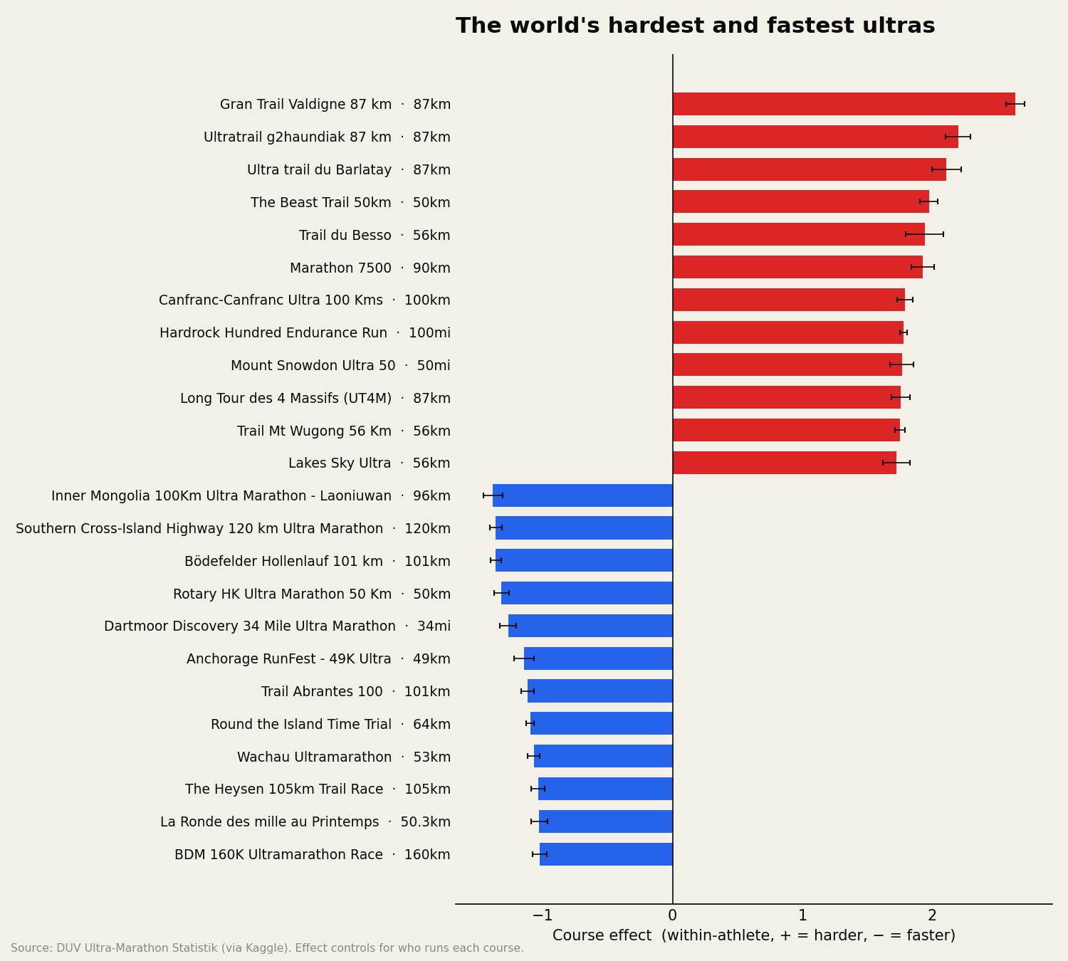
The hard end is mostly races you won't recognise: short, near-vertical mountain and sky courses — the hardest of all is the Gran Trail Valdigne, 87km in the Italian Alps — where the climbing per kilometre is relentless and the clock has nothing to do with fitness. The famous names come next: Hardrock is the hardest big race in the set, with the Barkley Fall Classic right behind it, then the American hundreds — Wasatch, Western States, Leadville — strung out below. The fast end is flat road and rolling 50–100Ks, where the only thing between you and a quick time is your legs. The error bars are the 95% confidence intervals — narrow, because every ranked course clears hundreds of runners across at least three editions, so no single freak day sets the number.
Two things worth saying about what this measures. First, unlike a track, an ultra course's "effect" is honestly a bundle — climb, altitude, terrain, heat, cut-offs — and that's the point: it's everything about the place that makes it hard, rolled into one number you can rank. Second, the order is the trustworthy part; treat the exact size as a strong hint, not a stopwatch.
Steep is only half of it
The effect is one bundled number, but its most obvious ingredient is climb. Here are eight well-known courses ranked by how much they make you ascend per kilometre — UTMB stacks nearly 10,000 metres over 174km; a road 56K barely registers — alongside a tool that carries your finish from a race you've run to one you haven't, translating it through each course's within-athlete effect rather than its profile.
Loading…
The interesting part is where the two halves disagree, and it is the whole reason UTMB lands where it does. UTMB is the steepest course here by a distance — nearly 10,000 metres of climb — yet its course effect is almost exactly zero, sitting around the 60th percentile of every ranked race, more "average" than hard. That isn't because UTMB is easy. It is because the within-athlete method asks how much a course slows runners against their own norm, and the field that toes the UTMB line is hardened on exactly this terrain; they are not slowed by what they train for. Leadville, gentler underfoot, slows those same runners more. Climb is visible on a course profile. How much a course actually costs a given runner is not, and that is the number this measures.
Is the signal real?
A ranking will always come out the other end, even from noise — so we tested whether this one is more than that. We shuffled the course labels at random, which destroys any genuine course-to-course signal by design, then measured how much spread in course effects the shuffled data still produced. If our real ranking were noise dressed up, the shuffled runs would match it.
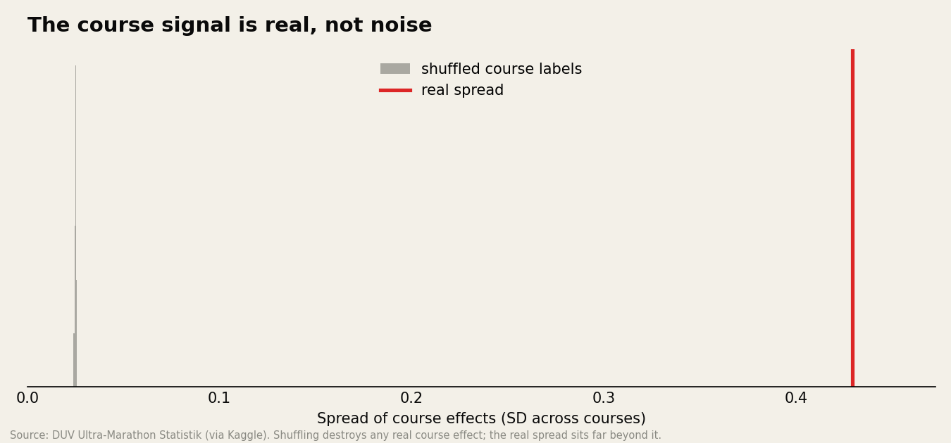
They don't come close. The real spread sits hundreds of standard deviations beyond the shuffled distribution — the gap between Hardrock and a flat 50K is not something chance manufactures.
We've left timed races (24-hour, 6-day) out of this first cut — there you measure distance covered, not a finish time, so they need their own treatment. They're next.
This is the first in a series built on the same 7.5M-result archive — the aging endurance curve, the closing gap between men and women at distance, and an atlas of where the sport is exploding are on the way. We build ontrack to turn the noise of real training and racing into something you can act on.
Ultrarunning series
Part 1 of 3
- 01The world's hardest ultrasyou’re here
- 02When do ultrarunners actually peak?
- 03An atlas of ultrarunning